


How to Make a Line Graph in Excel
A Line Graph, or line chart, is used to display trends in data over time, by connecting data points using straight lines. Line graphs can compare data over time for one or more groups, and can be used to measure changes over long or short periods of time.
This tutorial will show you how to make and edit a Line Graph in Excel
-->How to Make a Line Graph in Excel
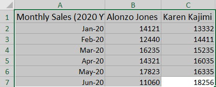
Step 1: Select the data you want displayed in the Line Graph
Use your mouse to select the data you would like to include in your Line Graph.
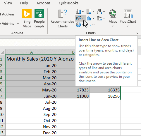
Step 2: Click the Insert Tab, and then Click the Line Symbol in the Charts Group
Once the data is selected, click in the Insert tab to display the Charts section on the ribbon.
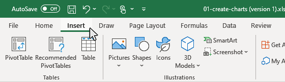
Then click on the Insert Line or Area Chart button in the Charts section on the ribbon, then the Insert Line or Area Chart window will appear in the workbook.
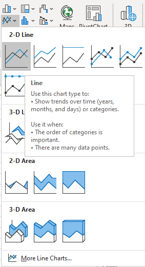
Step 3: Click the Line button from the Insert Line or Area Chart window.
Click the Line button from the Insert Line or Area Chart window, then the chart will appear in the workbook.
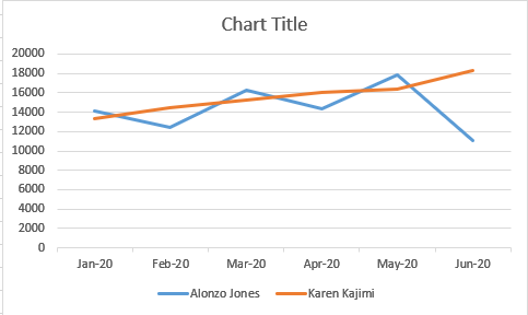
Result: Your Line Graph will appear on your worksheet
You will now see your line graph appear in your worksheet. Now you can start adding chart elements and formatting to your chart. Continue reading for more details on adding chart elements and chart formatting.
How to Add Chart Elements to a Line Graph in Excel
Step 1: Click on a blank area of the chart
Use the cursor to click on a blank area on your chart. Make sure to click on a blank area in the chart. The border around the entire chart will become highlighted. Once you see the border appear around the chart, then you know the chart editing features are enabled.
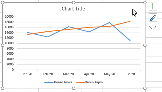
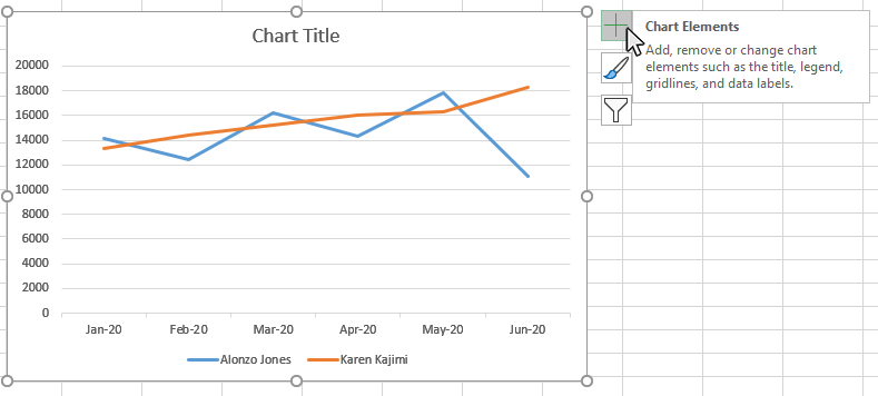
Step 2: Click on the Chart Elements button next to the chart
Once the chart name area is highlighted, you will see the Chart Elements button next to upper right hand side of the chart. The button looks like a plus sign. Doing this will open the Chart Elements window.
Step 3: Check the Chart Elements you would like to add from the Chart Elements window
Once you have opened the Chart Elements window, you will see a number of items you can select to add to your chart. Check the Chart Elements you would like to display and they will appear on your chart. You can click on the arrow next to each Chart Element option for some additional formatting options.
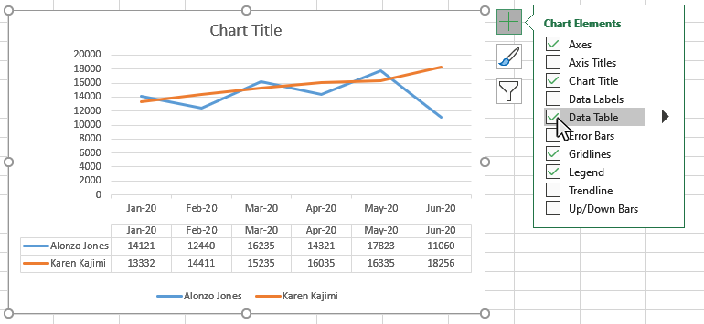
Here are the available chart elements for a Line Graph:
- Axes
- Axes Titles
- Chart Title
- Data Labels
- Data Table
- Error Bars
- Gridlines
- Legend
- Trendline
- Up/Down Bars
Each of these chart elements can be formatted in a variety of ways. Please see our other tutorials on how to add and format each chart element.
How to Format a Line Graph in Excel
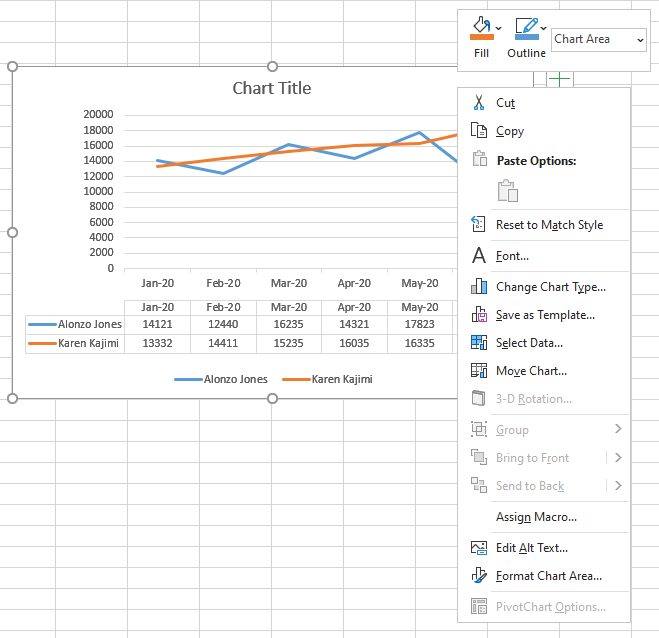
Step 1: Right-Click on a blank area of the chart
Use the mouse to right-click on a blank area on your chart. On the menu that appears select the Format Chart Area option.
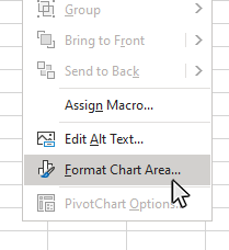
Step 2: Select the Format Chart Area option
On the menu that appears select the Format Chart Area option. Doing this will open the Format Chart Area panel on the right side of the workbook.
Step 3: Use the Format Chart Area panel to make changes to the appearance of your Line chart
Once you have opened the Format Chart Area panel, you will see a number of items you can modify on your chart. use these features to create a custom look for your Line Graph.
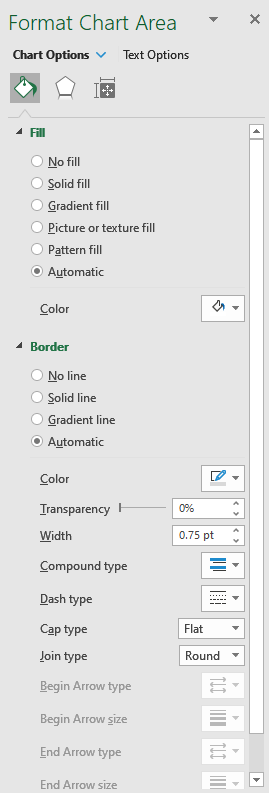
Here are the available chart elements for a Line Graph:
- Fill
- Border
- Shadow
- Glow
- Soft Edges
- 3-D Format
- Size
- Properties
Please note: You can also right click on any of your chart elements and open a separate formatting panel for that particular item. The Format Chart Area panel will be the one you want to use when formatting the main structure of the chart.
Next Topic
How to Make a Pie Chart in Excel
Thanks for checking out this tutorial. If you need additional help, you can check out some of our other free Excel Chart Tutorials, or consider taking an Excel class with one of our professional trainers.